Linear Regression and Classification
Linear Regression
Given training inputs \(D = \{\mathbf{x}_1, \cdots, \mathbf{x}_N\}\), where each \(\mathbf{x}_i\) is an \(M\times 1\) dimensional vector, and outputs \(\{y_1, \cdots, y_N\}\). Let’s fit a function of the form \(f(\mathbf{x}, \boldsymbol{\omega}) = \boldsymbol{\omega}^\intercal\mathbf{x} = \sum_{i=1}^M \omega_i x_i\) to this data by minimizing the cost function
\[\begin{equation} L(\boldsymbol{\omega}, D) = \sum\limits_{n=1}^N(f(\mathbf{x}_n, \boldsymbol{\omega}) - y_n)^2 + \lambda(\boldsymbol{\omega}^\intercal \boldsymbol{\omega}) \end{equation}\]Load the variables in the file Assignment2.mat:
import scipy.io as sio

mat_contents = sio.loadmat('Assignment2.mat')
M = mat_contents['M'][0][0]
NTest = mat_contents['NTest']
NTrain = mat_contents['NTrain']
NValidation = mat_contents['NValidation']
lambdas = mat_contents['lambdas'][0]
xTrain = mat_contents['xTrain']
yTrain = mat_contents['yTrain']
xValidation = mat_contents['xValidation']
xTest = mat_contents['xTest']
yTest = mat_contents['yTest']
Fit the parameters to the data xTrain and yTrain (where each row of xTrain corresponds to one data point), using \(\lambda = 0\), i.e. no regularization:
# When lambda=0, the cost function becomes the linear regression cost function.
from sklearn.linear_model import LinearRegression

lr = LinearRegression(fit_intercept=False)
lr.fit(xTrain, yTrain)

train_score=lr.score(xTrain, yTrain)
test_score=lr.score(xTest, yTest)

print("linear regression train_score:", train_score)
print("linear regression test_score:", test_score)
linear regression train_score: 0.2103670173790424
linear regression test_score: 0.028635201294539673
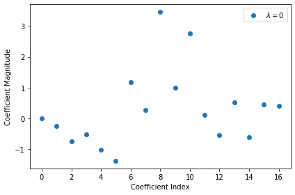
Plot the vector of \(\boldsymbol{\omega}_o\) obtained:
import matplotlib.pyplot as plt
%matplotlib inline

plt.plot(np.arange(M),lr.coef_[0],linestyle='none',marker='o',label='$\lambda = 0$')
plt.xlabel('Coefficient Index')
plt.ylabel('Coefficient Magnitude')
plt.legend()
plt.tight_layout()
plt.show()
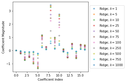
Train multiple versions of model on the training set, using values \(\lambda = 1, 5, 10, 25, 50, 75, 100, 250, 500, 750, 1000\). Make a plot that shows the \(R^2\) score of model on the training and the test set changes according to \(\lambda\):
from sklearn.linear_model import Ridge

max_score = 0
train_scores = []
test_scores = []
for alpha in lambdas:
  #  comparison with alpha value
  rr = Ridge(alpha=alpha, fit_intercept=False)
  # higher the alpha value, more restriction on the coefficients;
  # low alpha -> more generalization, coefficients are barely
  # restricted and in this case linear and ridge regression resembles
  rr.fit(xTrain, yTrain)
  ridge_train_score = rr.score(xTrain,yTrain)
  ridge_test_score = rr.score(xTest, yTest)
  print("ridge regression train_score (lambda={}): {}".format(alpha, ridge_train_score))
  print("ridge regression test_score (lambda={}): {}\n".format(alpha, ridge_test_score))
  train_scores.append(ridge_train_score)
  test_scores.append(ridge_test_score)
  if ridge_test_score > max_score:
    max_score = ridge_test_score
    best_lambda = alpha
print('Best test_score: ' + max_score)
print('Best lambda value: ' + best_lambda)
ridge regression train_score (lambda=1): 0.21036066672760512
ridge regression test_score (lambda=1): 0.029849131984993615

ridge regression train_score (lambda=5): 0.21021533304377527
ridge regression test_score (lambda=5): 0.03440747021886592

ridge regression train_score (lambda=10): 0.20979301155579222
ridge regression test_score (lambda=10): 0.039494074527527956

ridge regression train_score (lambda=25): 0.20730028335518547
ridge regression test_score (lambda=25): 0.05143990765830231

ridge regression train_score (lambda=50): 0.200667514883452
ridge regression test_score (lambda=50): 0.06364636760246345

ridge regression train_score (lambda=75): 0.19264950767997058
ridge regression test_score (lambda=75): 0.06999475532603039

ridge regression train_score (lambda=100): 0.18425782721905504
ridge regression test_score (lambda=100): 0.07294112699192068

ridge regression train_score (lambda=250): 0.14072348984759375
ridge regression test_score (lambda=250): 0.0669484700877866

ridge regression train_score (lambda=500): 0.09753514977549305
ridge regression test_score (lambda=500): 0.0476158268753597

ridge regression train_score (lambda=750): 0.07347976540616152
ridge regression test_score (lambda=750): 0.03424846910983148

ridge regression train_score (lambda=1000): 0.05833862843834714
ridge regression test_score (lambda=1000): 0.02520355472544611

Best test_score:  0.07294112699192068
Best lambda value:  100
plt.plot(lambdas,train_scores,label='train')
plt.plot(lambdas,test_scores,label='test')
plt.xlabel('lambda')
plt.ylabel('score')
plt.legend()
plt.tight_layout()
plt.show()
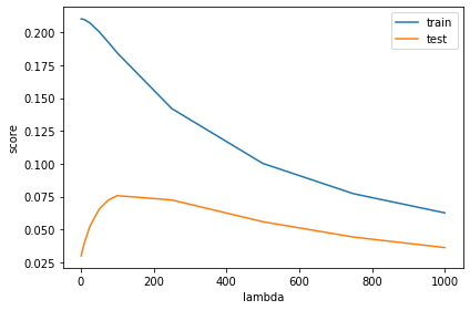
fig = plt.figure()
ax = plt.subplot(111)

for alpha, coefs in zip(lambdas, rr_coefs):
    ax.plot(np.arange(M),coefs[0],alpha=0.5,linestyle='none',marker='*',label='$\lambda = {}$'.format(alpha))

plt.xlabel('Coefficient Index')
plt.ylabel('Coefficient Magnitude')
plt.legend(bbox_to_anchor=[1,0.5],loc='center left')
plt.tight_layout()
plt.show()
We have the value of \(\lambda\) which gives us the best generalization performance. Use this model to predict the \(y\) values for the data xValidation:
rr = Ridge(alpha=best_lambda, fit_intercept=False)
rr.fit(xTrain, yTrain)
rr.predict(xValidation)
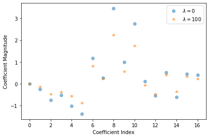
By inspecting the vector \(\boldsymbol{\omega}\) obtained for the best model, we can find which dimensions of \(x\) are important for predicting \(y\), and which are irrelevant:
plt.plot(np.arange(M),lr.coef_[0],alpha=0.5,linestyle='none',marker='o',label='$\lambda = 0$')
plt.plot(np.arange(M),rr.coef_[0],alpha=0.5,linestyle='none',marker='*',label=r'$\lambda = {}$'.format(best_lambda))
plt.xlabel('Coefficient Index')
plt.ylabel('Coefficient Magnitude')
plt.legend()
plt.tight_layout()
plt.show()
Ridge Regression
Self-defined Ridge Regression model:
import numpy as np

class RidgeRegression():
  def __init__(self):
    self._weights = []
    self._vlambda = 0

  def fit(self, X, y):
    self._weights = self._get_weights(X, y)

  def _get_weights(self, X, y):
    XXT_sum = 0
    Xy_sum = 0
    for i in range(X.shape[0]):
      XXT_sum += np.matmul(np.array([X[i]]).T, np.array([X[i]]))
      Xy_sum += np.array(X[i]).T * y[i]

    return np.matmul(np.linalg.inv(XXT_sum + self._vlambda * np.identity(X.shape[1])), Xy_sum)

  def errors(self, X, y):
    errors_sum = 0
    for i in range(X.shape[0]):
      errors_sum += (np.inner(self._weights, X[i]) - y[i])**2
    return errors_sum

  def set_lambda(self, vlambda):
    self._vlambda = vlambda

  def weights(self):
    return self._weights

  def pred(self, x):
    return np.inner(self._weights, x[i])
Verify self-defined Ridge model in Scikit-Learn:
mrr = RidgeRegression()
mrr.set_lambda(best_lambda)
mrr.fit(xTrain, yTrain)
print(np.allclose(mrr.weights(), rr.coef_[0]))
True
We can see the weights are identical, so the self-defined model works right.
Linear Classification
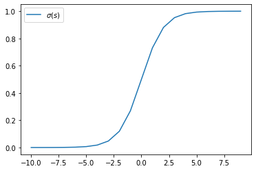
The logistic function \(\sigma(s) = 1 / (1 + \exp(-s))\) has connection with linear classification in Gaussian models. Plot \(\sigma(s)\) as well as \(\log\sigma(-s)\) as a function of \(s\):
import numpy as np
from scipy.special import expit

s = np.arange(-10, 10)
plt.plot(s, expit(s), label='$\sigma(s)$')
plt.legend()
plt.show()
s = np.arange(-100, 100)
plt.plot(s, np.log(expit(s)), label='$\log(\sigma(s))$')
plt.legend()
plt.show()
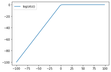
For large \(s>0\), \(\log\sigma(s)\sim 0\) and \(\log\sigma(-s)\sim -s\).
Use the file LinearClassification.mat, in which there exists training data xTrain (a matrix of size \(N = 500\) with \(D = 2\)) with labels tTrain. Here is to train and compare two classification algorithms on this data.
Calculate the means and covariances of each of the two classes, as well as the average covariance \(\Sigma = \frac{1}{2}(\Sigma_+ + \Sigma_-)\). Use \(\mu_+, \mu_-\) and \(\Sigma\) to calculate the weight vector \(\boldsymbol{\omega}\) and offset \(\omega_o\) with Gaussian linear discriminant analysis method.
import numpy as np
import scipy.io as sio

mat_contents = sio.loadmat('LinearClassification.mat')
tTrain = mat_contents['tTrain'].ravel()
xTrain = mat_contents['xTrain']
xTest = mat_contents['xTest']
tTest = mat_contents['tTest'].ravel()

xTrain_pos = xTrain[tTrain==1]
xTrain_neg = xTrain[tTrain==-1]

mean_pos = np.mean(xTrain_pos,axis=0)
mean_neg = np.mean(xTrain_neg,axis=0)

covar_pos = np.cov(xTrain_pos,rowvar=False)
covar_neg = np.cov(xTrain_neg,rowvar=False)

covar = 1/2*(covar_pos + covar_neg)

w = np.dot(np.linalg.inv(covar), mean_pos - mean_neg)
omega0 = -1/2 * np.dot(np.dot(mean_pos, np.linalg.inv(covar)), mean_pos) \
  + 1/2 * np.dot(np.dot(mean_neg, np.linalg.inv(covar)), mean_neg) + np.log(len(xTrain_pos)/len(xTrain_neg))

print(mean_neg)
print(mean_pos)
print(covar)
print(w)
print(omega0)
[-1.05104535 -1.23093304]
[1.31756564, 0.89598542]
[[ 7.10227261 -2.08986297]
 [-2.08986297  4.07128821]]
[0.57390989, 0.81701695]
0.06034962824845069
Verify our results in Scikit-Learn:
from sklearn.discriminant_analysis import LinearDiscriminantAnalysis

LDA = LinearDiscriminantAnalysis(store_covariance=True)
LDA.fit(xTrain, tTrain)

print(np.allclose(LDA.means_, [mean_neg, mean_pos]))
print(np.allclose(LDA.coef_[0], w))
print(LDA.intercept_[0] == omega0)
True
True
True
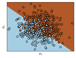
Plot the data as well as the decision boundary into a 2D plot:
x_min, x_max = xTrain[:, 0].min() - .5, xTrain[:, 0].max() + .5
y_min, y_max = xTrain[:, 1].min() - .5, xTrain[:, 1].max() + .5
h = .02  # step size in the mesh
xx, yy = np.meshgrid(np.arange(x_min, x_max, h), np.arange(y_min, y_max, h))
Z = LDA.predict(np.c_[xx.ravel(), yy.ravel()])

# Put the result into a color plot
Z = Z.reshape(xx.shape)
plt.figure(1, figsize=(4, 3))
plt.pcolormesh(xx, yy, Z, cmap=plt.cm.Paired)

# Plot also the training points
plt.scatter(xTrain[:, 0], xTrain[:, 1], c=tTrain, edgecolors='k', cmap=plt.cm.Paired)
plt.xlabel('$x_1$')
plt.ylabel('$x_2$')

plt.xlim(xx.min(), xx.max())
plt.ylim(yy.min(), yy.max())
plt.xticks(())
plt.yticks(())

plt.show()
Calculate the (training) error rate of the algorithm, i.e., the proportion of points in the training set which were misclassified by the model. Also calculate error rate on the test set using the data in xTest and tTest.
print(1 - LDA.score(xTrain, tTrain))
print(1 - LDA.score(xTest, tTest))
0.18799999999999994
0.21399999999999997
Calculate the parameters of the decision function \(y(x) = x^\intercal A x + b^\intercal x + c\) of the ‘quadratic discriminant analysis’ that can be derived by doing classification in a Gaussian model without assuming that \(\Sigma_+ = \Sigma_-\), and calculate the training and the test error rate of this algorithm.
# Using LogisticRegression with PolynomialFeatures
from sklearn.preprocessing import PolynomialFeatures
from sklearn.linear_model import LogisticRegression

poly = PolynomialFeatures()
xPoly = poly.fit_transform(xTrain)
logreg = LogisticRegression(solver='liblinear')
logreg.fit(xPoly, tTrain)
print(1 - logreg.score(xPoly, tTrain))
print(1- logreg.score(poly.fit_transform(xTest), tTest))
0.19199999999999995
0.21599999999999997
# Using Quadratic Discriminant Analysis
from sklearn.linear_model import QuadraticDiscriminantAnalysis

QDA = QuadraticDiscriminantAnalysis()
QDA.fit(xTrain, tTrain)
print(QDA.score(xTrain, tTrain) == logreg.score(xPoly, tTrain))
print(QDA.score(xTest, tTest) == logreg.score(poly.fit_transform(xTest), tTest))
True
True
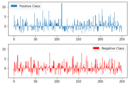
For each data point in test set, we can calculate its (scaled and signed) distance to the decision boundary (i.e. the values of \(y(x)\) for each \(x\)). Make a plot which contains the bar chart of all points in the positive class (in blue) as well as a bar chart of the points in the negative class (in red):
dists = QDA.decision_function(xTest)
dists_pos = dists[tTrain==1]
dists_neg = dists[tTrain==-1]

fig, axs = plt.subplots(2, sharey=True, tight_layout=True)

axs[0].bar(range(len(dists_pos)), dists_pos, label='Positive Class')
axs[0].legend()
axs[1].bar(range(len(dists_neg)), dists_neg, color='red', label='Negative Class')
axs[1].legend()
plt.show()
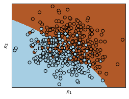
Calculate the decision boundary of the quadratic algorithm and plot it:
x_min, x_max = xTrain[:, 0].min() - .5, xTrain[:, 0].max() + .5
y_min, y_max = xTrain[:, 1].min() - .5, xTrain[:, 1].max() + .5
h = .02  # step size in the mesh
xx, yy = np.meshgrid(np.arange(x_min, x_max, h), np.arange(y_min, y_max, h))
Z = QDA.predict(np.c_[xx.ravel(), yy.ravel()])

# Put the result into a color plot
Z = Z.reshape(xx.shape)
plt.figure(1, figsize=(4, 3))
plt.pcolormesh(xx, yy, Z, cmap=plt.cm.Paired)

# Plot also the training points
plt.scatter(xTrain[:, 0], xTrain[:, 1], c=tTrain, edgecolors='k', cmap=plt.cm.Paired)
plt.xlabel('$x_1$')
plt.ylabel('$x_2$')

plt.xlim(xx.min(), xx.max())
plt.ylim(yy.min(), yy.max())
plt.xticks(())
plt.yticks(())

plt.show()
Regression with basis functions
Use the file LinearRegression.mat, in which there exists training data xTrain (a vector of length \(N=20\)) with outputs tTrain. Here is to train a nonlinear regression model form \(x\) to \(t\) using basis functions.
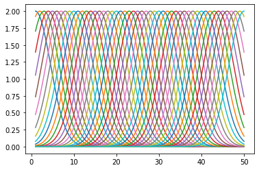
Use a 50-dimensional basis-set, i.e. the ‘feature-vector’ \(z(x)\) should be 50-dimensional with \(z_i()x = 2\exp{(-(x-i)^2/\sigma^2)}\) with \(\sigma=5\) and \(i=1, \cdots, 50\). Make a plot of the 50 basis functions (use the x-values in xPlot):
mat_contents = sio.loadmat('LinearRegression.mat')
tTrain = mat_contents['tTrain'].ravel()
xTrain = mat_contents['xTrain']

def z_i(x, i, sigma=5):
  return 2 * np.exp(-(x-i)**2 / sigma**2)

for i in range(1, 51):
  plt.plot(xPlot, z_i(xPlot, i))
plt.show()
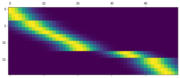
Calculate the \(50\times N\) matrix zTrain for which the \(n\)-th row is \(z(x_n)\):
zTrain = np.zeros((len(xTrain), 50))
for i in range(1, 51):
  zTrain[:,i-1] = np.apply_along_axis(z_i, 1, xTrain, i).ravel()

plt.matshow(zTrain)
plt.show()
Using \(\alpha = \beta = 1\), calculate the posterior mean \(\mu = E(\omega\mid D)\) (a \(50\times 1\) vector) and plot it:
from sklearn.linear_model import BayesianRidge

clf = BayesianRidge(fit_intercept=False)
clf.fit(zTrain, tTrain)


plt.plot(clf.coef_, marker='o', linestyle='none', label='posterior mean')
plt.legend()
plt.show()
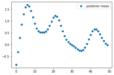
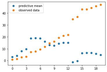
The posterior mean \(\mu\) is a vector of weights of the basis functions. Calculate the corresponding predictive mean by \(f_\mu(x) = E(t(x)\mid D) = \sum_{i=1}^{50} \mu_i z_i(x)\) and plot the predictive mean and the observed training data into the same plot:
pred_mean = np.dot(zTrain, clf.coef_)

from matplotlib.ticker import MaxNLocator

plt.plot(pred_mean, marker='o', linestyle='none', label='predictive mean')
plt.plot(xTrain, marker='o', linestyle='none', label='observed data')
plt.gca().xaxis.set_major_locator(MaxNLocator(integer=True))
plt.legend()
plt.show()
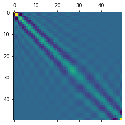
Calculate the posterior covariance over weights \(\Sigma = \text{Cov}(\omega\mid D)\) and display it:
plt.matshow(clf.sigma_)
plt.show()
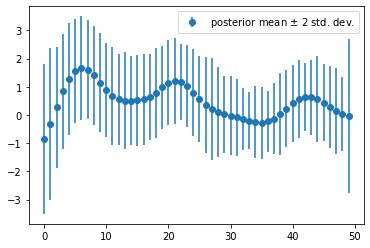
Extract the diagonal of \(\Sigma\) and obtain the posterior variance, and use it to plot \(\pm 2\) standard deviation error on the bars in previous part:
plt.errorbar(np.arange(50), clf.coef_, yerr=2*np.sqrt(clf.sigma_.diagonal()), marker='o', linestyle='none', label='posterior mean $\pm$ 2 std. dev.')
plt.legend()
plt.show()
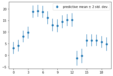
Calculate the predictive variance \(\text{Var}(r\mid D, x)\) for each \(x\) (use values in xTrain), and use it to plot error bars for the predictive distribution, i.e. \(f_\mu(x)\pm 2\sqrt{\text{Var}(t\mid D, x)}\).
pred_var = 1 + np.dot(np.dot(zTrain, clf.sigma_), zTrain.T).diagonal()
print(pred_var)
[1.67595615, 1.58096524, 1.52765088, 1.6241353 , 1.69887031,
 1.63049027, 1.65893968, 1.92393627, 1.85173695, 1.88886473,
 1.95160423, 1.67824906, 2.12771708, 2.48926543, 2.392271  ,
 1.73165649, 1.66802733, 1.50291101, 1.63521892, 2.11965196]
plt.errorbar(range(len(xTrain)), pred_mean, yerr=2*np.sqrt(pred_var), marker='o', linestyle='none', label='predictive mean $\pm$ 2 std. dev.')
plt.gca().xaxis.set_major_locator(MaxNLocator(integer=True))
plt.legend()
plt.show()
